Venmo Redesign
How might we…
reimagine a service with a flawed user experience?
The Venmo app interface makes it difficult to execute the two main functions of this app: paying and requesting money. Venmo users lead busy lives and would like to spend as little time as possible paying and requesting money from friends, family, and others.
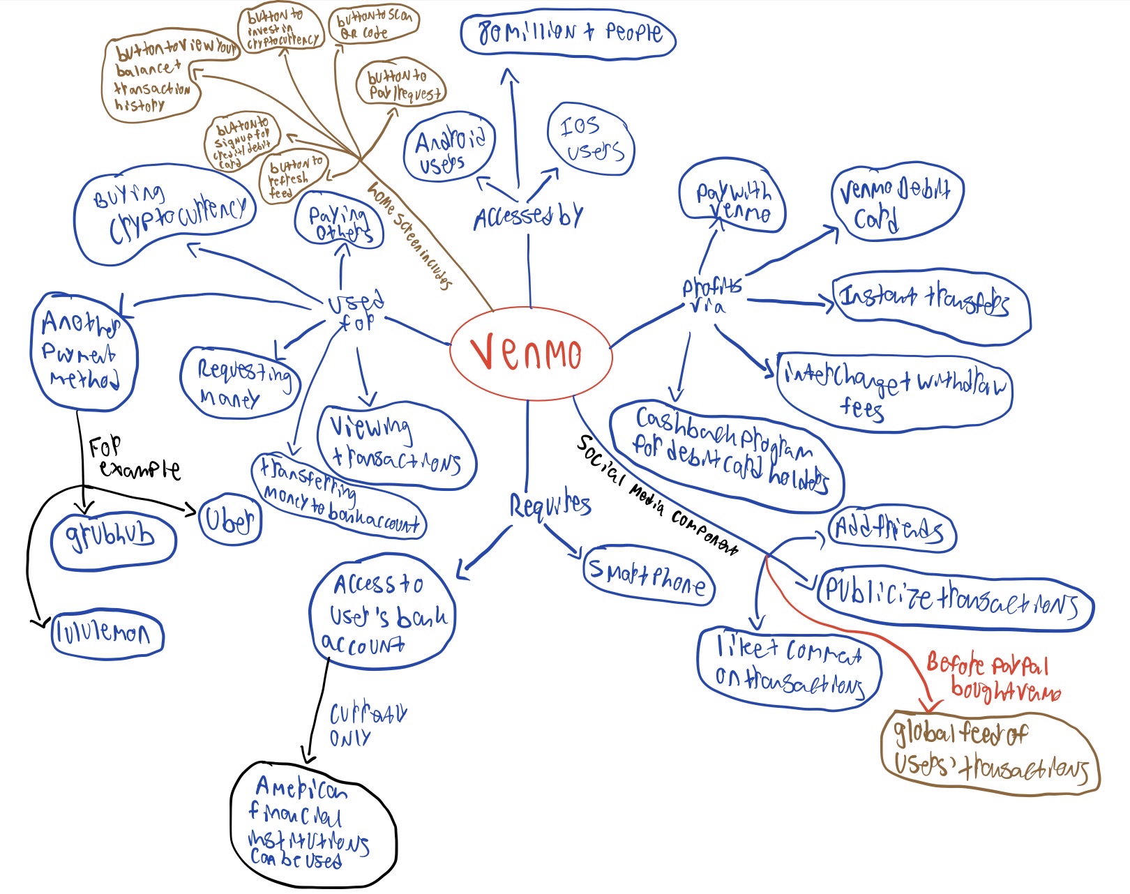
Gathering Insights
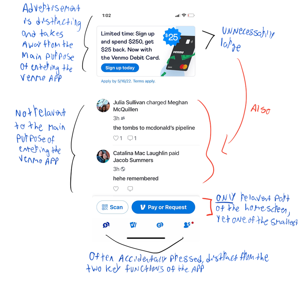
Through user interviews, usability testing, and journey mapping, I uncovered the main pain points Venmo customers were experiencing with the UI. Users were unsatisfied with the time required to find outgoing requests, disappointed in the overcrowded home screen, and struggled to find friends when requesting.
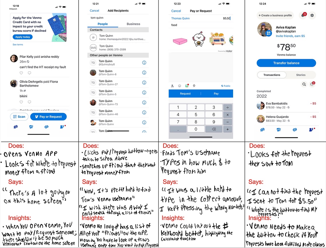
Synthesizing Insights
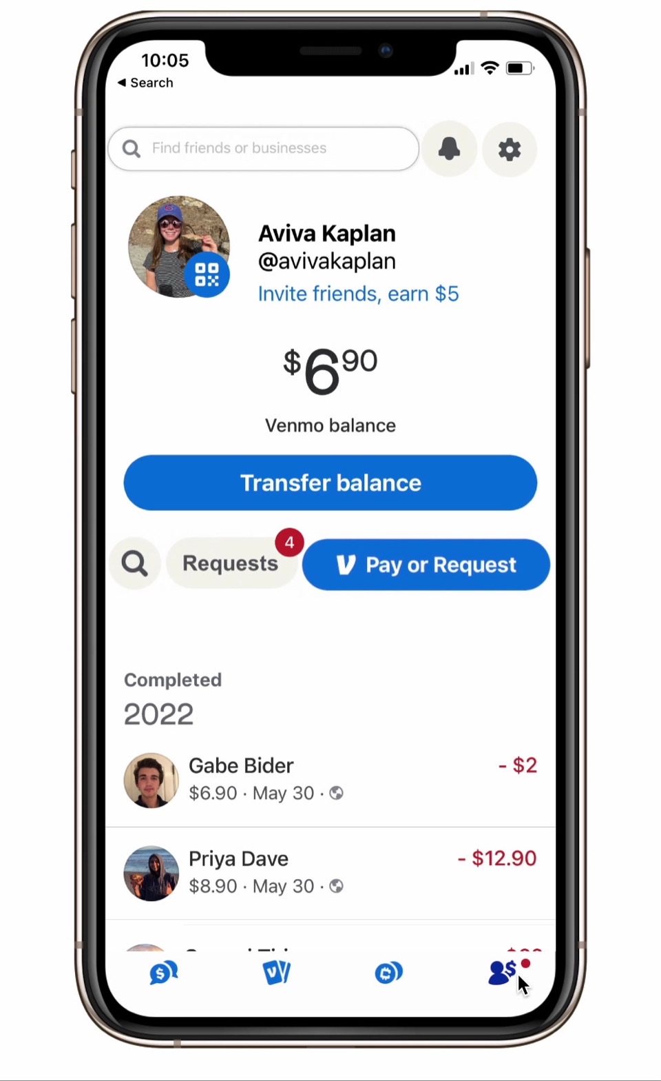
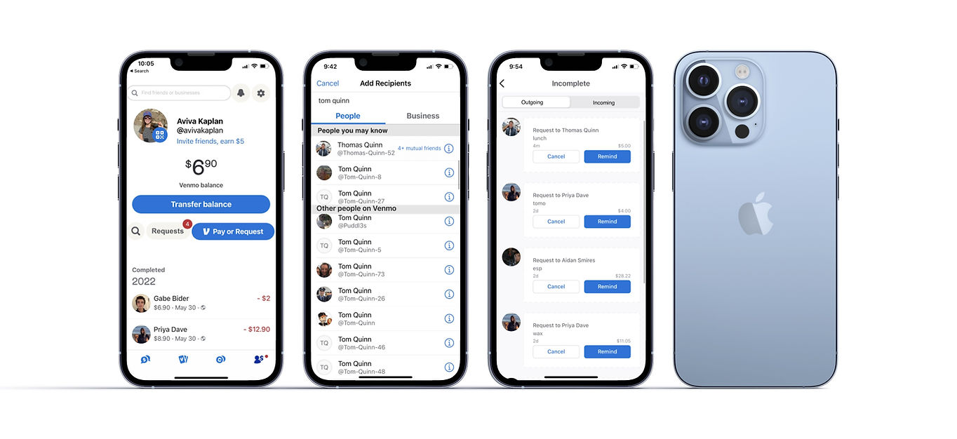
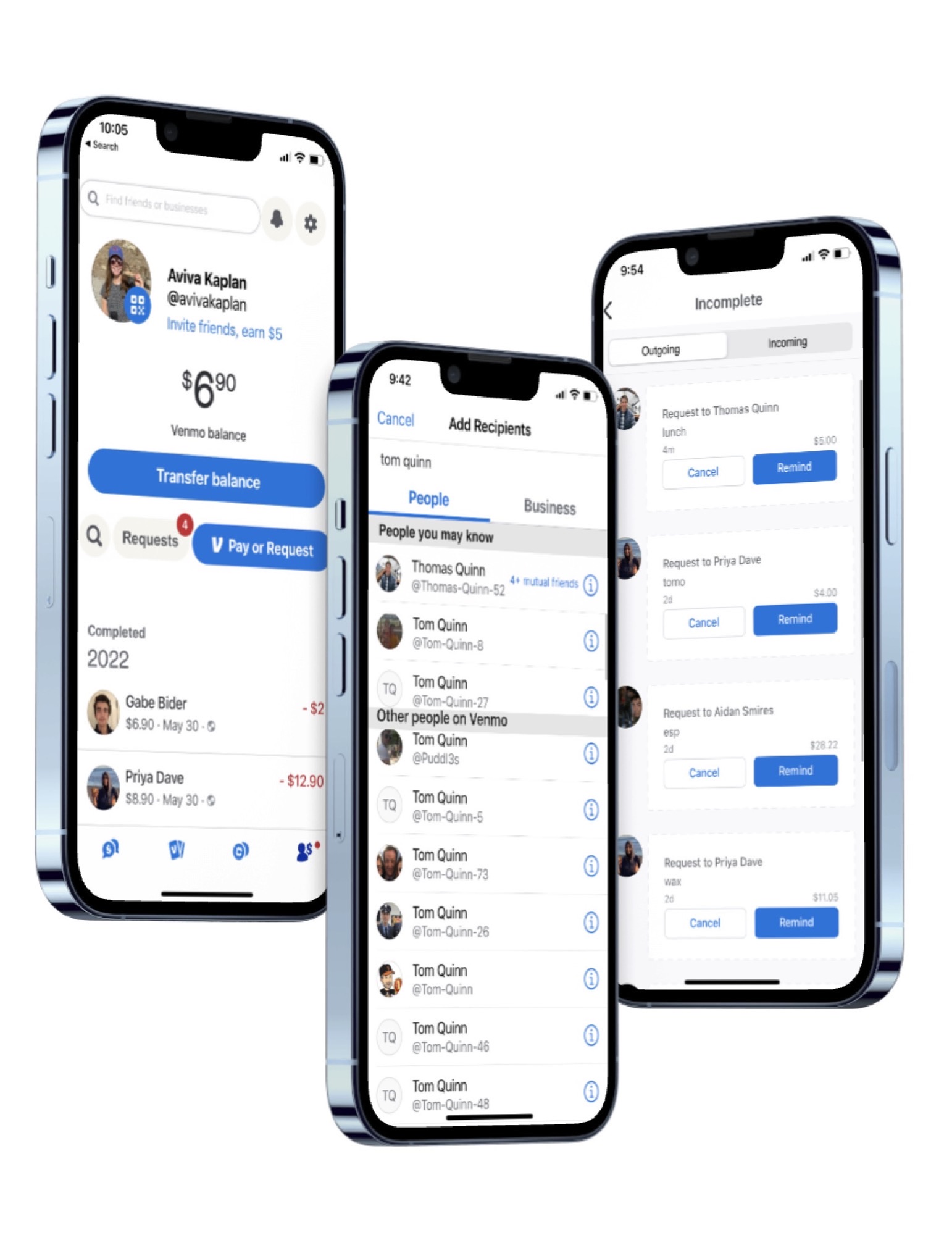
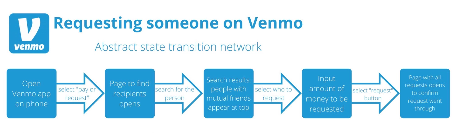
Upon gathering insights through UX research, I selected the pain points to address that would have the biggest impact. To resolve difficulty finding friends to request, I added a “mutual friends” feature. I also rearranged the home screen, making the “pay or request” and “transfer balance” buttons more apparent. Finally, I combined incomplete outgoing and incoming requests into one screen with two tabs.
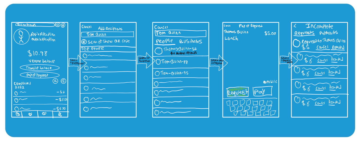
Final Prototype
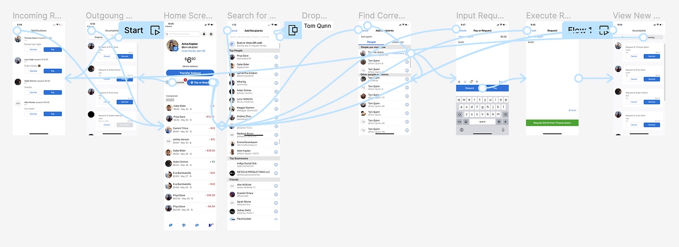
After conducting user interviews on my low-fi prototype, I mocked it up in Figma and did more usability testing. Gathering more insights and feedback on user needs through this round of UX research, I created my final, functioning prototype.